
Does good design have to look good as well?
Look at any Apple product. Even if you baulk at the price tag, you have to admit they look gorgeous. And the popular assumption is therefore that Good Engineering needs to Look Good as well.
The design authority Dieter Rams lists aesthetics at #3 in his list of Top 10 Design Principles (behind “innovation” and “useful”) and most people would choose a “good looking” design over a “bad looking” one (based on personal definitions of course). But is this the whole story?
This is a software blog but let’s take an example completely unrelated to software – the Fairchild Republic A10 aircraft aka “The Warthog”.

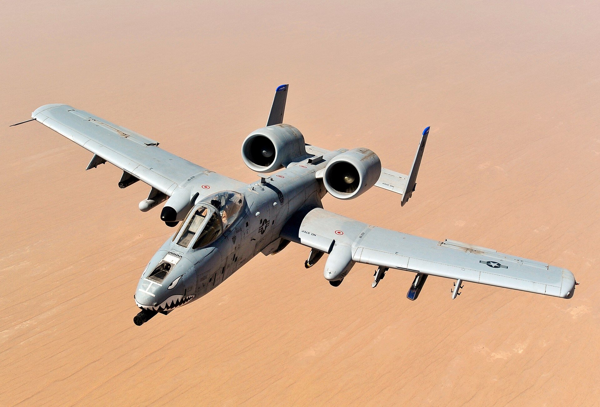
Quite possibly the ugliest aeroplane ever made and totally worthy of its moniker, but let’s take a closer look at some of its features and the thinking behind them:
The wing looks like a barn door
The A10 is a ground attack aircraft and therefore generally in quite close proximity to the groundwhiel operating. Being close to the ground also means being close to sea level in most places and much denser air. Its role also means that it needs to maneuver tightly so a BIG wing with a SMALL Reynolds Number is a good thing.
Barn Door is the perfect form for its function.
The engines are on stalks
Your typical supersonic delta wing jet has the engine inside the fuselage for aerodynamic and strength reasons. But with the A10 the fuselage (apart from a tiny seating area for the pilot) is occupied by “The Gun”. It’s in capitals because it literally occupies the entire fuselage cavity with a 2 metre long cage of gun barrels and a magazine as big as a beer tanker.
A secondary reason for having the engines so far back so they are above the tail is so that the heat signature they produce is at least partially masked from below by the tail, making it harder for a heat-seeking missile to be successful when launched from the ground.
The tail is…huge
The horizontal stabilizer is approximately twice as large as it needs to be for stable flight. Why? So that if half the tail should be removed due to hostile gunfire, then the plane will still fly.
This is also why there are two vertical stabilizers (fins) - you can still fly if one is taken out.
Should I go on…?
You get the point.
How does this apply to software?
One man’s ugly is another man’s beautiful. Some developers like the elegance of a single complex statement that fulfills the purpose, while others eschew elegance and even efficiency for simplicity and construct the same capability in many more lines of code.
No-one sets out to create an ugly thing deliberately but for me the true beauty of well-designed software is not completely defined by its external appearance or arbitrary measures of code volume or complexity.
I love a design where everything has a purpose that it fulfills and is as simple as possible to achieve that purpose (but no more simple than that). Part of the design brief with software is always maintainability so as long as your naming is consistent and everything is DRY I don’t mind stretching my eyes to cover 10 lines where it was possible to write it in one (but then make future generations of developers scratch their heads or force them to write comments longer than the code itself as “gifts” to their future colleagues).
I look at the A10 and I see a beautiful design (terrible purpose, yes, but beautiful design because it is fit for that purpose). This is the same way I look at a stored procedure or an SSIS script task that oozes quality purely by its simplicity and understandability.
Conclusion
Does good design have to be beautiful as well? I’m in the NO camp because function weighs heavier than form in my world. What do you think?