
Introducing…SyncHub Insights
SYNCHUB Insights is the next step in building powerful reports from your cloud data. With Insights, you can begin transforming your raw data into a reportable format, and then share that data with others, in the form of email notifications or charts & dashboards.

Insights is a multi-tier architecture. Each layer builds on the one before it, but they can each be used independently as well. Not coincidentally, the tiers coincide with a typical BI workflow:
Build a SQL query
Stage/cache your data into a reportable format
Visualize & share your report
Let’s take a detailed look at each section in turn now.
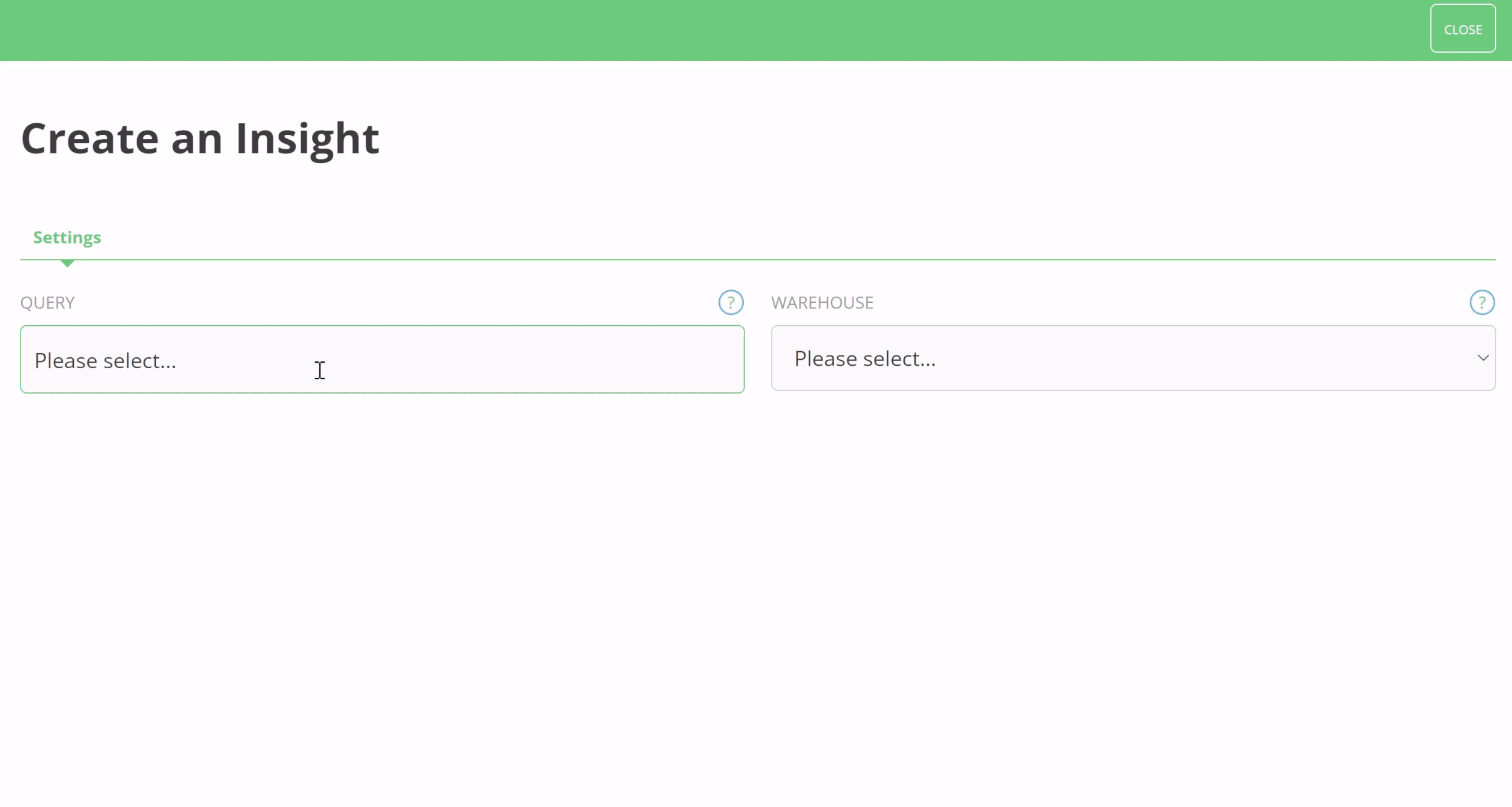
Step 1/3 - Build a SQL query
As with any BI tool, the foundation of your Insights are SQL queries. SyncHub already has a powerful Query Editor, which we’ve covered in a different blog post, so won’t go into too much detail here. But here’s a little screenshot to jog your memory…
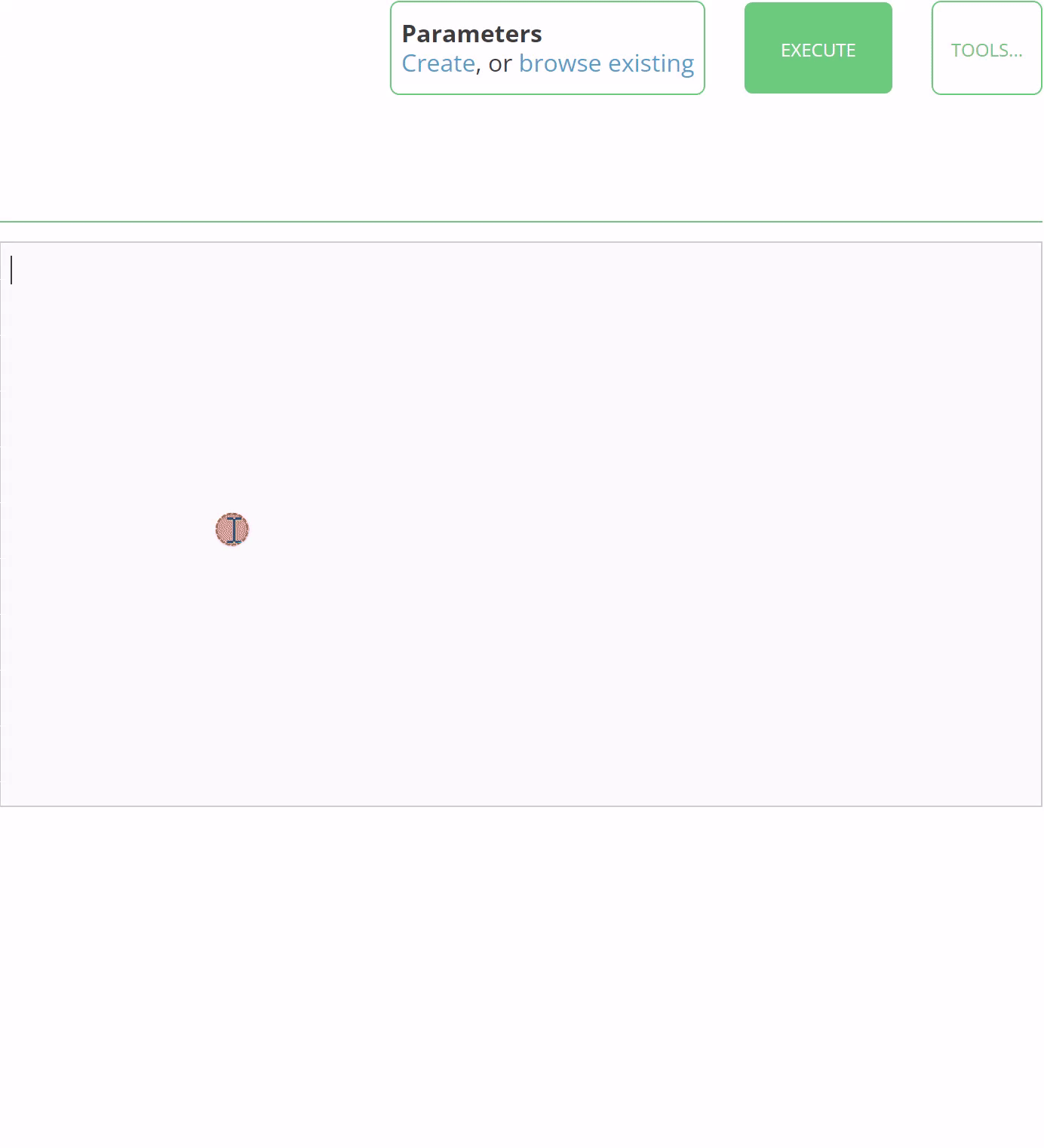
Did you notice that Parameters option in our Query Editor above? These are a must read, but we’ve covered them in a separate blog post here.
Step 2/3 - Stage your data
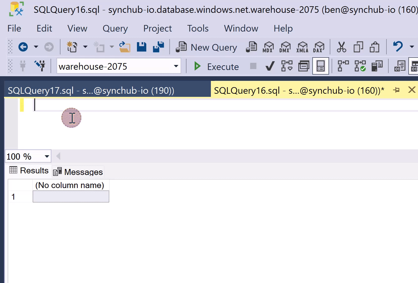
Now we get to the good part. You can take any of your queries and schedule them to automatically run on a scheduled basis. The results of each run are stored in a dedicated database table in your warehouse:
Your query results are stored in a dedicated database table
Each Insight reserves a table name in your data warehouse, where we store the results. This means you can access the results directly from your existing BI tool - the same way that you access the cloud data that you’ve synced to SyncHub. Here for example, we are querying our results using SQL Server Management Studio:
This simple mechanism - storing results in a dedicated database table - opens a wealth of possibilities:
Keep a rolling sum of sales in the last 30 days
Transform your UTC dates to a local time zone
Import supplementary data which is not part of your SyncHub connector’s data model
…and much more
Run your Insight automatically
The second key feature above is that we run your query automatically, on a schedule of your choice. If you’re interested in yesterday’s sales, simply have the Insight run at 6am every morning and we’ll have the latest data ready and waiting for you when you arrive at work.
Step 3/3 - Visualizing your data
If you’re using a 3rd-party reporting tool, like Power BI or G-Sheets, then the staging feature above is probably as far as you need to go with our Insights functionality.
But for everyone else, we also offer dashboarding and charting tools which let you visualize and share your Insights with others.

You can assemble multiple Insights to make a Dashboard, then share it with others in your organisation:
Sharing your dashboards
What’s the point in building a beautiful dashboard if nobody can see it? With our permission system, you can granularly grant access to only those reports that people are allowed to see. And, unlike other reporting tools, you can invite as many people as you like, at no additional cost.

Or share via email…
If the dashboard access is too permissive, we also let you email a snapshot of the report to anybody you like…

…and a few minutes later…

To conclude
SYNCHUB Insights is a powerful & versatile addition to your Business Intelligence toolset. Use it to transform and stage complex queries, import supplementary data, or share your data with others.
Happy reporting!